Friday 2 March 2012
Audience feedback
After our teaser trailer was shown to a number of students and teachers at college, we presented them with a questionnaire that allowed us to produce statistics. 22 members of the college carried out the questionnaire.
Here are the responses:


Magazine cover analysis:

The puff adds an element allowing the consumer to recognise the importance of the issue, as it is a special edition.
There is a magazine website and slogan, allowing the consumer access to as much information as they want and advertising the magazine.
The colour scheme was based on an issue of "Empire" published with "Star Trek" as its feature article on the cover, as we were also using this magazine brand for our own and the "Star Trek" cover had elements that could represent our main character, who would appear on our front cover.
The barcode was used from a previous issue of "Empire" to add a professional look to the magazine.
The standard price and inclusion of the date the issue was "published" further adds authenticity to the issue.
The expression, composition and greyscale used in the main image shows a link to Norman Bates in "psycho", and how our charater's mental state is slowly eroding due to guilt, like Norman's did. Our trailer was very influenced by "Psycho" in many aspects, but image was the main one as Alfred Hitchcock understands how to frighten an audience with using limited shots containing iconography.
The main plug links to the tagline of the film, we followed the typical way the text is written with a play on words that also incites curiosity in the reader .
The plug is used as further advertisement to the consumer if the cover article is not to their interest, as well as showing what else the magazine is offering that links with the theme of horror/thriller this particular issue has.
Thursday 1 March 2012
Film poster: Conventions
We have included the following conventions of a horror film poster:
The production company, director, editor and producer at the bottom of the poster.
The 2 main stars of the film and central are above the credits highlighting their importance.
The use for graphic blood stained/smeared font.
A capturing tagline at the top of the poster.
A menacing image, for example, we have used the image of a mask without an identity, this puts the audience on edge as they don't know who the killer is or what could be behind the mask.
The BBFC film rating: 18.
The title is in a graphic style, representing the blood of the victims.
A maximum of three colours are used on the posters so there is continuity.
The layout of the poster ensures that all of the important information is directly under the eye catching image.
A mask is used as the central image as an enigma.
The stars’ names are highlighted on the poster.
The credits are at the bottom of the poster for a more professional overall look.
The tagline is above the film title to engage the audience.


Monday 20 February 2012
"Hush Hush" Trailer: Final Product
A young woman moves to a small town university where she encounters a figure from a past she thought had been forgotten. As she attempts to escape the killer, the masked figure reveals her deadliest secret. Will she make it out alive?
The Final Girl Theory
The "Final Girl" theory is focussed on the belief that a woman that commits no sin will survive a horror movie and defeat the villain.
This is evident in classic Horrors such as:
Halloween
Friday the 13th
A Nightmare on Elm Street
Scream
Final Destination
The Texas Chain Saw Massacre
I Know What You Did Last Summer
Hellraiser
Alien
The Strangers
The Ring
The Grudge
Carol Clover, author of "Men, Women and Chainsaws: Gender in the Modern Horror Film" suggests that in these films, the viewer begins by sharing the perspective of the killer, but experiences a shift in identification to the final girl partway through the film.
However, Buffy Summers, the protagonist of the Buffy the Vampire Slayer TV series, is an example of a character deliberately designed by creator Joss Whedon as a more empowering alternative to the "final girl" cliché. Jason Middleton observes that although she fulfills the role of the final girl in killing monsters night after night, she is the antithesis of Clover's definition of final girls as boyish, not sexually attractive, favoring "practical" clothing, not sexually active, and often having a unisex name. Buffy is a cheerleader, a "beautiful blond" with a normal sex life, with a name that, Middleton observes, could not be more feminine. Buffy is, in the words of Jes Battis, "subverting" the final girl trope of B-grade horror films. In Middleton's words, she gets to have sex with boys and still kill the monster.
Film Marketing
Traditional Marketing:
Word of mouth is the least expensive form of promotion. The audience will grow in numbers and greater variety of gender and age with the public promoting it, as the public are more likely to recognise similarities in taste between their friends, family and associates and will be more likely to assume they will like the product because others have had positive opinions on them.
Contemporary Marketing:
Web 2.0 and social networking sites are also valuble, as they are only moderately expensive and acessable to many. They are also useful for targeting a specific audience, such as teenagers who use the internet as a social tool. Youtube and film sites are also ideal things to advertise on, and as films such as "Paranormal Activity" have demonstrated, an entire marketing campaign can be created online and be sucessful worldwide.
Past Advertising:
Time Restrictions:
Hitchcock developed a ‘time restriction’ at theatres that stopped the box office from selling tickets for ‘Psycho’ after the film had started. People were turned away if they were late.

Friday 10 February 2012
Editing And Sound: "Hush Hush"
After discussing the angles and content of the shots taken for the trailer and the desired pace and atmosphere with the group, we took into account the previous A2 trailers we were analysing and came to the conclusion that all of them contained:
- a chase scene
- a dragging scene
- darkness
- almost no dialogue at all
- fast cuts
We used these scene ideas for our trailer inbetween shots from the storyboard to tie the shots and music together. It was decided that distorted music that changed pace was needed, with various loud bangs. We were inspired by the Texas Chainsaw Massacre opening and combined extracts of that with a piece we found on youtube when looking for "Royalty Free Music" http://www.youtube.com/watch?v=zwHs07xUSNc
An A2 trailer called "I See You" http://www.youtube.com/watch?v=vMWxhksKoxQ that we were heavily inspired by also used the Texas Chainsaw Massacre music. it further stressed the importance of editing to your chosen music, and using the sound to emphasise your scenes in a way that will draw the desired reaction from the audience. The timing of the shots is crucial to the effect of the trailer.
By Using this site: http://www.youtube-mp3.org/ we were able to convert our music to an MP3 file by using the URL for the youtube video and begin the editing process using Adobe Premiere.
Wednesday 8 February 2012
Lighting: "Hush Hush"
The only shots that included a lot of natural light were the establishing shots and the shot introducing the final girl.
The others required either a dimly lit setting (blinds pulled down over windows) or the L.E.D light in the dark room during the scenes of the dead bodies.
Artificial lighting played a large part in our trailer as we followed the idea that "what is not seen is scarier than what is seen" and wanted to control what remained hidden and what was focussed on.
The dim lighting also created an atmosphere that accompanied the narrative and pace of the trailer.
Tuesday 7 February 2012
Locations: "Hush Hush"
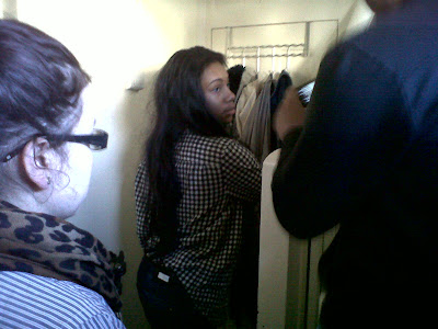
There are many different locations used in shooting the trailer, varying constantly according to when the area is free and the lighting available. All shots were filmed within the college, due to the acessability and a variety of rooms within the college. Also, it allows us to literally show a familial setting in a different light, to affect the audience. Furthermore, the college allowed us to portray a similar university setup, with corridors and learning facilities.
List of locations in the college used for the trailer:
Establishing shot of the college gives the audience an idea of the location of where the film is set.
College halls - Some scenes within the college hallways, however we discarded the scenes due to them being too light.
College Kitchen - Took shots of the killer picking up the knife.
Classrooms - Shots were taken within class rooms with both killer and final girl.
Media Studio - The shots of the two girls dead were shot in this studio, and some shots of the killer were also shot here.
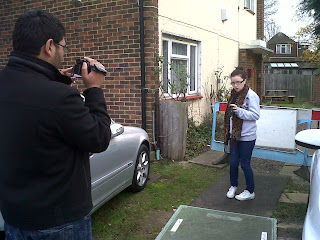
First Day Of Filming

Although the setting caused the shots taken on this day to be useless to our trailer as it was too confined and the daylight created the wrong atmosphere, it provided us with experience with the camera and prepared us for complications with actors, angles, setting, mis en scene and lighting.
It also forced us to plan our shots, timings and settings more carefully and reminded us to be consistant with these things also, as the light will change according to the time of day and the actor will not wear the same/similar clothing all the time, so we need to inform them of when we plan to shoot.
We also needed to work around other lessons and divide our spare time accordingly, therefore we devised a schedule.
By comapring lesson timetables we decided to film when we all had free lessons or when two of us had them at the same time, then we would share the footage with the 3rd group member and all contribute to the editing and sound.
Monday 9 January 2012
Practice Trailer - When Chickens Attack
Below is the schedule for the Media Deep Learning Day
P1: Get a camera introduction from Mr Varghese – showing us how to use the cameras effectively and correctly.
P2: Organise the storyboard – making sure all shots are in the correct place and have been approved by the whole group.
P3: Update any blog posts. Create posts on cast, costume, props, lighting and shot schedule.
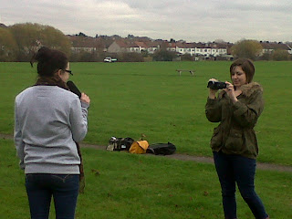
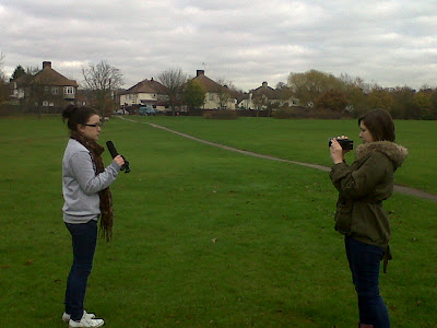
P4: Film test shots for news report scenes in Norbury Park. After filming, create a parody of the newsreport.
P5: Edit shots and put together in Adobe Premiere Pro CS3.
P6: Continue editing. After completion, scan all shots into the computer to put onto blogs.
P1: Get a camera introduction from Mr Varghese – showing us how to use the cameras effectively and correctly.
P2: Organise the storyboard – making sure all shots are in the correct place and have been approved by the whole group.
P3: Update any blog posts. Create posts on cast, costume, props, lighting and shot schedule.
P4: Film test shots for news report scenes in Norbury Park. After filming, create a parody of the newsreport.
P5: Edit shots and put together in Adobe Premiere Pro CS3.
P6: Continue editing. After completion, scan all shots into the computer to put onto blogs.
Mis En Scene
Settings And Locations
The decision to have a number of settings themed around educational buildings allowed us flexibility within our scenes and variety, beneficial to the overall "professional" look of the trailer. Enclosed spaces are also necessary when creating a horror trailer, as they emphasise anxious situations. Our reporter scene will be filmed either outside or in a "news studio" to highlight the difference in atmosphere between the chase scenes and the others.
Costume, Hair And Make Up
Tells us immediately whether the film is set in the present and what society/or culture it's centres around.
Act as an instant indicator to the audience of a character’s personality, status & job.
Certain costumes can signify certain individuals (e.g. black cloak of a vampire) or groups (e.g. policemen).
Facial Expressions And Body Language
Facial Expressions provide a clear indicator of how someone is feeling.
If someone is smiling broadly, we assume they are happy but we may get a different feeling if this is accompanied by dramatic/scary music.
Body Language may also indicate how a character feels towards another character or may reflect the state of their relationship.
Position of Characters/Objects within a Frame
Positioning within a frame can draw our attention to an important character/object.
A film-maker can use positioning to indicate relationships between people.
Colour
Colour carries certain connotations which may add meaning to a scene.
It can give a scene a particular look, feel or mood.
It may also be used for dramatic effect.

Locations - Possible
Norbury Park - News Reporter
Showing that characters other than the final girl have freedom and are not restricted by a situation the way that Chris is.
Showing that characters other than the final girl have freedom and are not restricted by a situation the way that Chris is.
My House - Final Girl
Adressing the need for a small space that is familiar and usually safe for the final girl, to put the audience on edge.
Adressing the need for a small space that is familiar and usually safe for the final girl, to put the audience on edge.
Props - Possible
In relation to Horror - Props we'll be using:
- Chef's Knife
- Clown doll
- Box of matches
- Backpack
- Evidence bags
- Cocktail and shot glasses
- Flashlight
- Photos
- Sheets
- Sack
- Rope
- Broken cables
Costume:
Chris (final girl): Skinny jeans, converse, band t-shirt, headphones + backpack.
Charlie (villain 1): Sack, rope, white t-shirt (with blood), jeans, boots.
Fred (villain 2): Sack, rope, shirt, suspenders, jeans, converse.
Janet (victim 1): body-con skirt, green jumper, black vest, burgundy vans.
Marilyn (victim 2): body-con skirt, neutral vest top.
News reporter: black blazer, black skirt, white shirt, black shoes, tights.
Extras: smart/casual.
Actors - Possible
Chris: Final Girl

Leila Mohammadi
Charlie: Main Killer

Miguel Spencer
Fred: second killer

Lee Wright
Janet and Marilyn: Dead Girls

Danielle Mcgrath

Me
News Reporter:

Ozge Altinok
Non Diegetic Sound
Sound whose source is neither visible on the screen nor has been implied to be present in the action:
narrator's commentary
sound effects which is added for the dramatic effect
mood music
Non-diegetic sound is represented as coming from the a source outside story space.
The distinction between diegetic or non-diegetic sound depends on our understanding of the conventions of film viewing and listening. We know of that certain sounds are represented as coming from the story world, while others are represented as coming from outside the space of the story events. A play with diegetic and non-diegetic conventions can be used to create ambiguity (horror), or to surprise the audience (comedy).
Another term for non-diegetic sound is commentary sound.
Lighting - Shadows
The use of shadow emphasizes the fear of the unknown we as an audience experience when watching a horror film. The mind will create a scenario different to each individual, as we know what scares us the most and will play on it when the film does not show us certain aspects of itself. Shadows often exaggerate the object/person's form they have taken, such as count Orlok's deformed appearance in "Nosferatu", and will also change the atmosphere and mood of a scene negatively.
A modern example of the use of shadows for these reasons is "Jennifer's Body", candles are used to cause the shadow to flicker slightly and as they often represent romance, they contrast with the sillhouettes of Jennifer and her first victim as well as the actions in the scene; the violent killing.
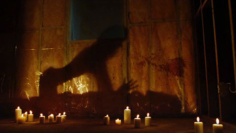
A modern example of the use of shadows for these reasons is "Jennifer's Body", candles are used to cause the shadow to flicker slightly and as they often represent romance, they contrast with the sillhouettes of Jennifer and her first victim as well as the actions in the scene; the violent killing.
Subscribe to:
Posts (Atom)